Taking great photos is never enough, it’s how you present them that matters. This was true when I first started my photography business over two decades ago, and it’s even more true now. In some ways the challenge is greater than it’s ever been because of the fragmentation of the online experience, plus expectations have never been higher than they are now. Indeed online audiences are spoiled beyond belief for quality images, and have an ever growing appetite to view quality content on retina quality displays.
The challenge is how to get your work online and make sure they look their best?
This became a very personal challenge last month when my wife, Shellie Froidevaux, embarked on updating her website. She had kind of neglected it over the years, because she’s been so busy working with her clients and it seemed the website was busy working for her too. It was always a good website, but that doesn’t mean it couldn’t be better.
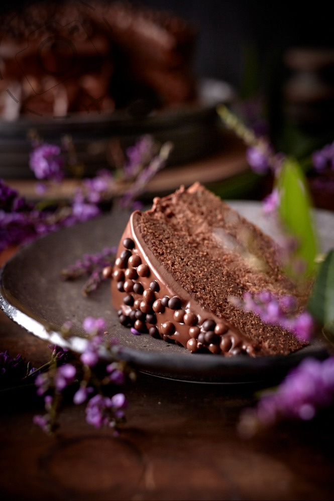
ironchefshellie.com
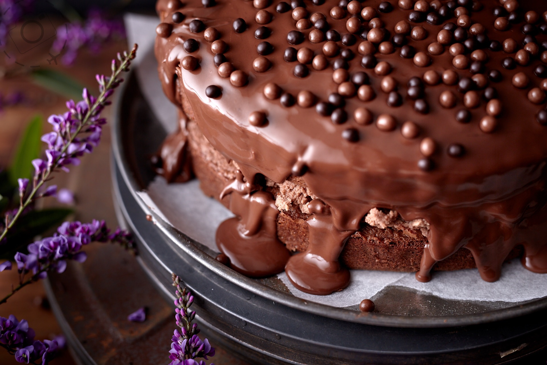
Shellie is a sensational photographer. She won’t tell you that, she’s too modest, but she is. As we entered our third month living the lockdown lifestyle we’ve had time to rethink what our future might be, and in the process rethink what her website was achieving. Through fresh eyes it seemed that the full beauty of her photography was just not coming through on the website. They weren’t “presenting” as good as they could.
The journey that unfolded from that realisation is a path we are still on. Websites are *always* under construction after all. Since the Covid pandemic we’ve had a bit more time than usual to throw at this kind of task. Instead of just scrabbling together an update, this time we embarked on a process of revision, refinement and reinvention. More than anything we wanted to reimagine how the images are presented.
The first hurdle with presenting online is the divergence of devices. When we think of the internet we often think of a computer screen first. The desktop. Sometimes that desktop is a laptop, with a smaller screen and often a fair bit less height to present a layout.
Half the time your internet experience is a touch screen though, not a workstation. iPads and smart phones are a major source of screen time, and so very often is the first contact with a new website as we seek out inspiration or information. Some sites work really well on a desktop but completely fail to make use of the iPad interface. They are worlds apart for experience, and hence worlds apart when working out how to present your photography.
And to my mind photography should never be regarded as passive; it should absolutely be an experience. You want your images to be the feature, not an afterthought. We don’t just make room for them, we MAKE the room FOR them.
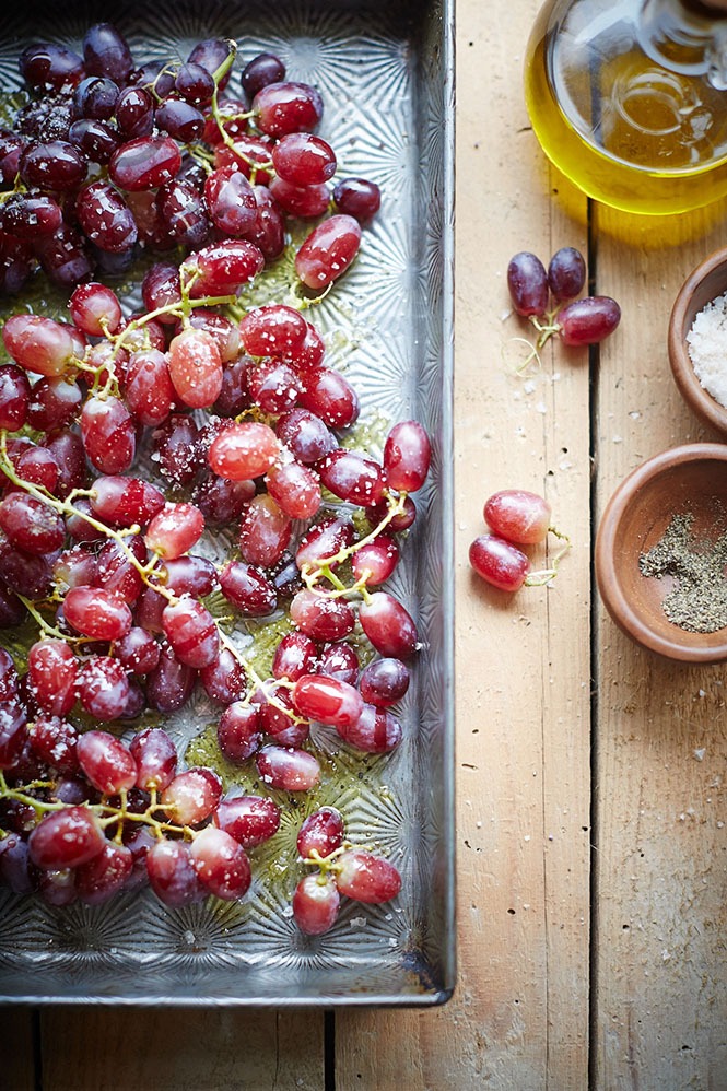
ironchefshellie.com
One of the big hurdles to the design process was having a clear idea of *what* the website is all about. I think this is true for many of us. We have lots of ideas in our head about things we want to work on, or goals we want to identify with. Some are strong, some are barely expressed, some are transient, some are core to who we are.
It becomes even worse for someone like Shellie who is so multi-talented. Her full range of skills can be applied in a wide range of settings, but it’s recipes and photography that Shellie wants to focus on. When her website loads onto someone’s screen, what version of Shellie Froidevaux does she want them to see? Which Shellie is she presenting? It’s the exact same problem of how to present a photo, only this time you’re using the photo to present an entire person and their creative potential.
I’m not yet sure if we’ve succeeded. Perhaps that is better judged by you. Feel free to pop over to her website at ironchefshellie.com and take a look, and share some thoughts.
What works for one person may not work for someone else of course. Despite having built the most polished a website we could achieve — that responds to so many different contexts and devices — there is still the thorny reality that it cannot necessarily respond to different audiences.
And presentation is always about the audience, not the photo.
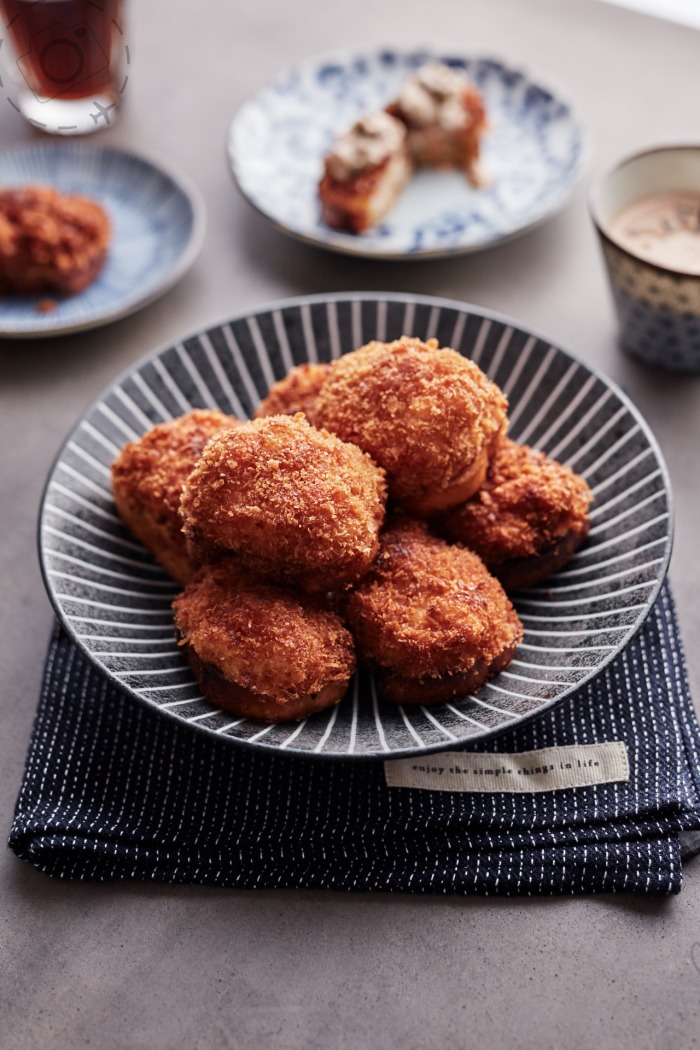
ironchefshellie.com

Keep Reading
Join Ewen's newsletter for monthly updates on new photography articles and tour offers...Subscribe Here
